Paradox Oils
From start-up to category best-seller: Transforming a brand through packaging design
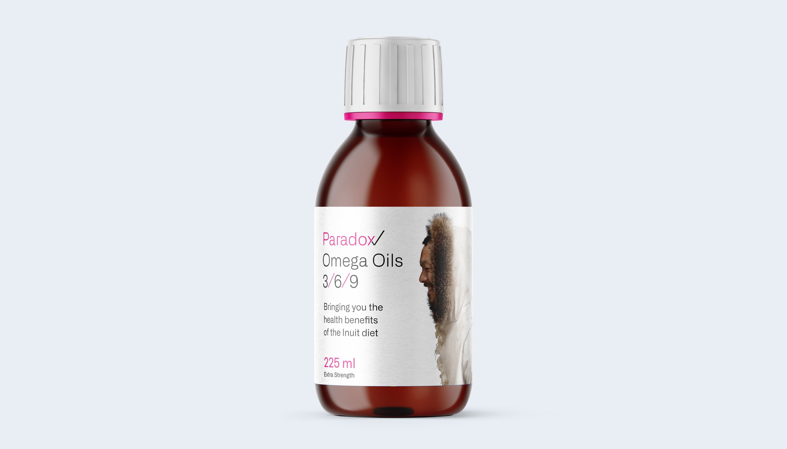
As a new entrant to the health supplement market in Northern Ireland, Paradox needed an identity that stood for something different, alongside packaging that could draw the eye in a saturated marketplace. The benefits of an Inuit-style diet was discovered in research and was something unique to the supplement sector.

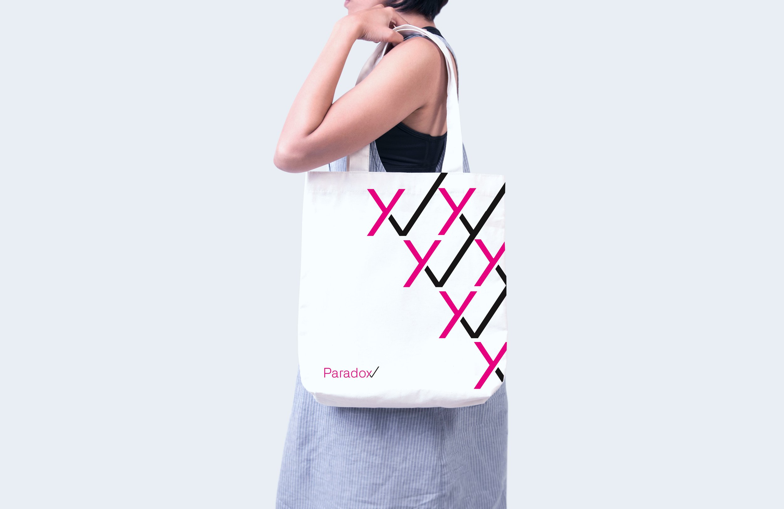
A ‘paradox’ was created within the logo with a tick that was simultaneously a cross; whilst the packaging could be rotated to create an Inuit-style kiss between two characters to grab, attention on the shelf.
Deliverables
– Brand Identity
– Packaging
– POS Design


How effective packaging design helped Paradox Oils
Shelf stand-out
With a host of colourfully packaged competitor products, a minimal approach was deployed to give Paradox maximum stand-out on the shelf. When your competitors zig it’s often smarter to zag.
Reflective of price point
With Paradox having a higher than average price in the marketplace, the packaging needed to communicate a feeling of medicinal potency to justify the purchase. This was delivered through the confident use of white space — reminiscent of powerful pharmaceutical products.
A unique proposition
The most successful creative ideas are built on top of great marketing ideas. With Paradox the focus was on the benefits of an inuit diet — a more unique and memorable angle than the common mediterranean choice.
Memorability
Emotions are closely linked to memories. Brand packaging designs that provoke emotions are more memorable than those that don't. Part of Paradox’s success was in part helped by the playful Inuit kiss performed by displaying two boxes side by side.


If you’d like to discuss improving the impact and memorability of your brand get in touch.
neil@harrisondesign.uk
+44 (0)77601 50101

